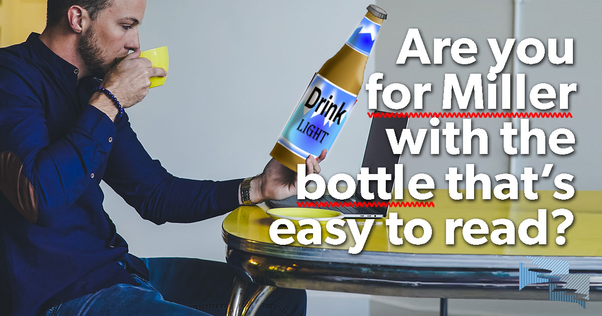
Are you for Miller with the bottle that is easy to read?
The U.S. Department of the Treasury's Alcohol and Tobacco Tax and Trade Bureau (TTB) manages what messages beer bottles are required to include. Under Part 7—Labeling and Advertising of Malt Beverages, Subpart C—Labeling Requirements for Malt Beverages, Paragraph 7.28 General requirements, "All labels shall be so designed that all statements required by this subpart are readily legible under ordinary conditions, and all the statements are on a contrasting background." Further, health warning statements must be legible as per the requirements given by Paragraph 16.22 General requirements.
These labeling requirements are true for all malt beverages, not only those produced by MillerCoors. It is only good and proper that labels designed to provide consumers with information and warnings be legible. But there are two problems with this regulation.
First, the regulation states that any font 1 mm high is considered "legible." This writer turned 50 this year (yes, yes, thank you). Amazingly, she does not yet need prescription glasses. But her near vision is going. How is 1 mm legible?
Second, there is no required warning that ales, pilsners, and lagers are disgusting. In fact, an argument can be made that the only decent beer is a nice porter or perhaps a hefeweizen with an orange slice. Although, admittedly, this writer hasn't tried all beers, this writer does stand on the assertion that any beer you can see through is not worth drinking.
But, even though the labels of Miller or any other beer should be easy to read, it is far more important to be familiar with a Bible that is easy to read.
This is what WOULD happen if GotQuestions.org genuinely, honestly answered all the mis-typed, autocorrected, or otherwise altered "spiritual" questions that come their way every day.
HOME | ABOUT | CATEGORIES | CONTACT | THE REAL SITE
© 2024 Got Questions Ministries. All rights reserved.

